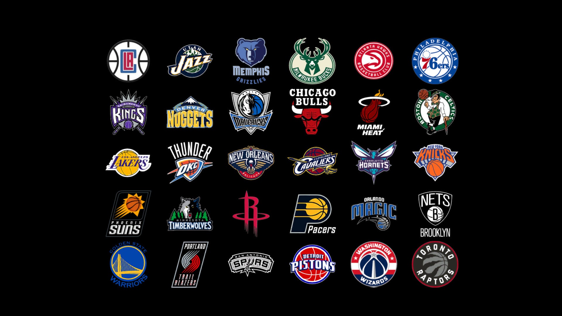
NBA Logos - some get an upgrade, others remain plain Jane.
This off season a couple of teams decided to make an upgrade. Utah’s one seemed long overdue as they’ve had the old school retro look for a while now.
Personally I’m a fan of anything old school. They’re such a tough gritty team, so going back to something that looks 70s/80s suits them perfectly. I was a big fan of the days when Stockton and Malone were running round in the Rocky Mountains style singlets, and I believe seeing our boy Dante Exum running the show in the “new” brand of Utah hoops (the musical note showing a basketball I think is clever) is going to be great! It’s a slight modification to what they had, but a brand new court design shows this team is meaning business this season!
Sacramento was another team who went with an upgrade. They probably needed one to be fair. New Arena needs a new look! Am I a fan of it? Not really. I was a big fan of their old logo when white chocolate and Chris Webb were running around (how that team never won a championship still baffles me). But times are a changing, and new logos mean new singlets, meaning more $$ for the franchise. Will a new logo be enough to keep Boogie Cousins around? Probably not!
Which brings me to my next point. Could you imagine if the Chicago Bulls or the Boston Celtics changed their iconic logos? I think there would be an uproar! When you think the Celtics, you think the little Leprechaun spinning the ball on his finger.
Likewise the Bulls. When you think Chicago, you see that angry Bull and the raging bull himself, Michael Jordan, winning multiple championships for the city.
But probably one of the greatest sports logo updates of all time goes to the Golden State Warriors. The old “Warrior Man” holding a lightning bolt did nothing for me. Then you see what they’ve come up with now, perfectly representing the Golden Gate Bridge (all you think about with SF) and it’s here to stay with successful times rolling on for the franchise!!
Let us know any of your all-time favourite NBA logos, good or bad!!
P.S. Bring back the Raptor Logo!! Is there anything better than a T-Rex dribbling a basketball???
Dave Bauk

